Mindler - bringing clarity to pyschologists’ calendar
UX & UI
Mindler is Sweden’s largest digital psychology provider, treatment blends video calls with a psychologist and exercises in the app. Mindler’s rapid growth and fast product development led to a lack of clarity in the psychologist workspace, Mindler Care. The calendar only showed a few hours at a time, making it difficult to see upcoming patient bookings.
The ask: Provide psychologists with a better overview of upcoming meetings and help them quickly identify key scenarios of patient bookings.
My role: Designer responsible for defining pains and opportunities of the calendar, facilitating workshares with stakeholders and implementing design solution with our developers.
The team: Product designer, PM, 2 psychologists, and tech team.
Understanding psychologist needs & identifying UX opportunities
To better understand the current calendar design, I audited the current library and identified potential opportunities to give psychologists a clearer overview of their meetings. Sharing potential design refinement with psychologists to align on current pains as well as developers to ensure my proposed refinements were reasonable within our scope.
This process helped me determine which features needed refinement, which could be removed, and which were essential for providing psychologists with the necessary meeting information.
Areas of interest to increase hours visible & clarity in timeslots:
Hierarchy and alignment of calendar actions.
Utilize empty space.
Refine timeslot information.
Simplify styling.
How might we reduce content within each timeslot while ensuring key meeting information remains clear?
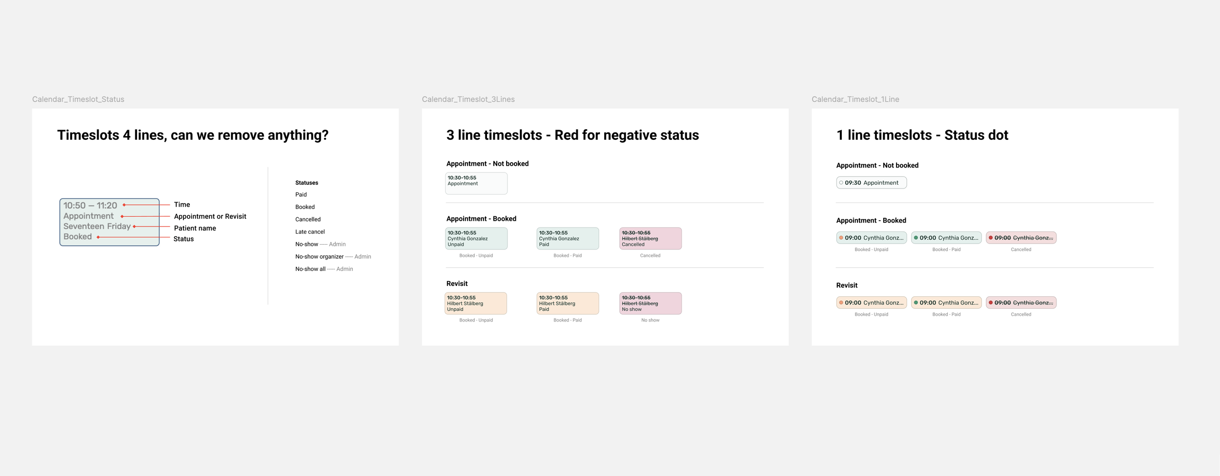
In order to display more hours of psychologists workday, we needed to reduce information in each timeslot to increase available space in the calendar. Based on an analysis of the current calendar timeslot types and facilitating discussions with stakeholders, we identified the most crucial information needed for reviewing upcoming meetings.
Key timeslot information:
Appointment time
Not booked vs. Booked timeslots
Status of booked timeslots - Unpaid, Paid, Cancelled, No show etc.
New patient vs. Reoccurring patient
Patient name
Sample material shared with stakeholders when facilitating discussion of key timeslot information.
Reducing timeslot information via status badge and background color
Not only did we provide psychologist with a better overview by increasing number of hours in the calendar but psychologists could more quickly understand their work day by refinements in timeslot styling.
Instead of using a 4-line design, we reduced timeslots to 1-line by adding background color and status dots to convey different booking scenarios and introduced a tooltip on hover in order to display the patient’s full name.
Psychologists could more quickly see whether a timeslot was:
Not booked or Booked.
New or Reoccurring patient.
Paid, Unpaid or Cancelled.
Condensing primary actions into a dropdown button, adjusting alignment of secondary actions and refining overall styling
Adjusting the placement of month, week, day and timeslot button at the top of the page created space to display psychologists' work hours. Also, refining the calendar to use the full vertical screen space, avoiding cropped hours.
With the new alignment, the primary action of “Add new” timeslots became more clear in the top right corner of the page.
Instead of 3 buttons for appointment types, condensing actions into a single dropdown button reduced clutter and saved space for visible hours.
Final thoughts & personal learnings
Some of my biggest learnings during the project include:
Utilising psychologist and stakeholder input helps ensure design is grounded in user needs and allows for effective product updates. Workshares help gather requirements from both a clinical and tech perspective.
Limitations of scope & UI libraries impact the final design. Due to startup pace and resources, past tech debt can influence design solutions in new projects. Being aware of these limitations & having an open dialogue with developers to ensure proposed solution is feasible within restrictions of the current calendar library.
Market-specific needs & worst-case scenarios can challenge the design. Understanding these needs is key to ensuring the solution is flexible for all use cases. Aligning stakeholders on how to adjust features to fit needs of all markets is crucial to the success of a project.


